Festival Branding
A promotional visual identity designed for a multicultural festival
Project Duration
12 Weeks (Sept-Dec 2025)
Design Category:
Information Design | Branding | UX/UI Design | Promotional Design
Tools used:
Adobe Illustrator and Adobe InDesign
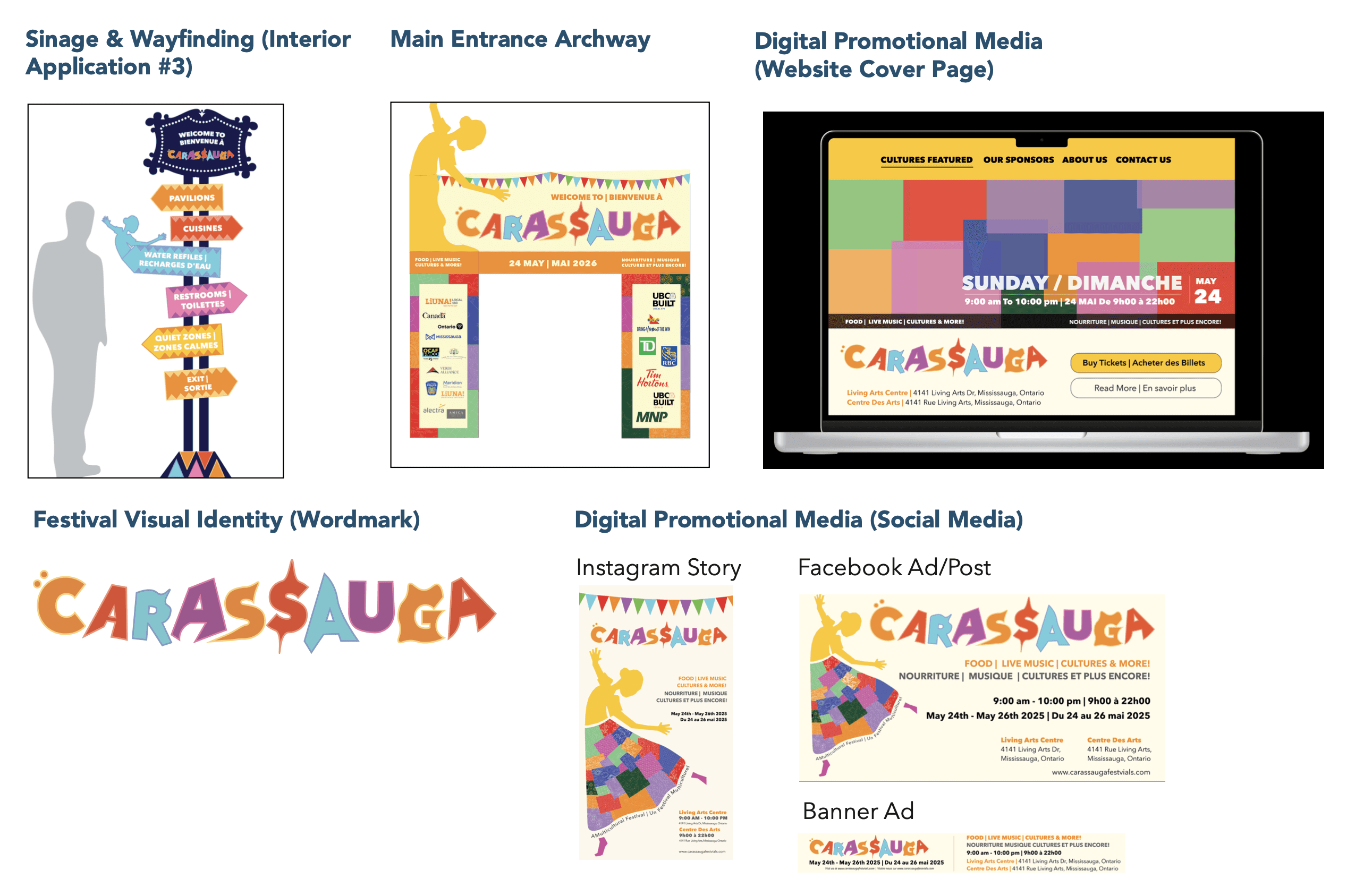
Project Background
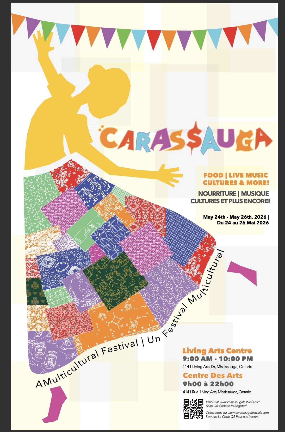
Phase one of this 12-week project focused on establishing the branding and visual language for a cultural festival. Three distinct design approaches were explored and applied across key touchpoints, including a large-format bilingual poster and digital/social media marketing assets. This foundational phase was critical in setting the tone, mood, and visual direction for the remainder of the project.
About the Carassauga Festival of Cultures
Carassauga Festival of Cultures is Canada’s largest multicultural festival of food and entertainment. Its purpose is to celebrate cultural diversity by representing multiple pavilions within the festival around the city of Mississauga, each dedicated to different cultures and cuisines. Its purpose is to allow visitors an opportunity to “travel the world” without leaving the city. Once inside a pavilion, visitors are surrounded by the sights, sounds, and tastes of the country being represented. For example, the host of each country gives visitors a taste of their cultural heritage by educating them through authentic cuisine, dance, and music. The festival has become an important annual 3-day event in Mississauga’s calendar, and its popularity has steadily increased in recent years.
Defining the Theme
The theme of the Carassauga Festival of Cultures is to “travel the world in one weekend.” It includes aspects of multiculturalism and cultural diversity as its main purpose. The atmosphere is vibrant and festive, with over 22 cultural pavilions being included in this event. Each pavilion provides an inclusive experience by allowing visitors the chance to experience firsthand what life in another culture is like through live performances, traditional music and dance, cuisines, and interactive experiences. This festival incorporates a wide range of colors, ranging from warm hues to cool hues, to represent cultures and attract visitors to join.
Figuring out the Challenge
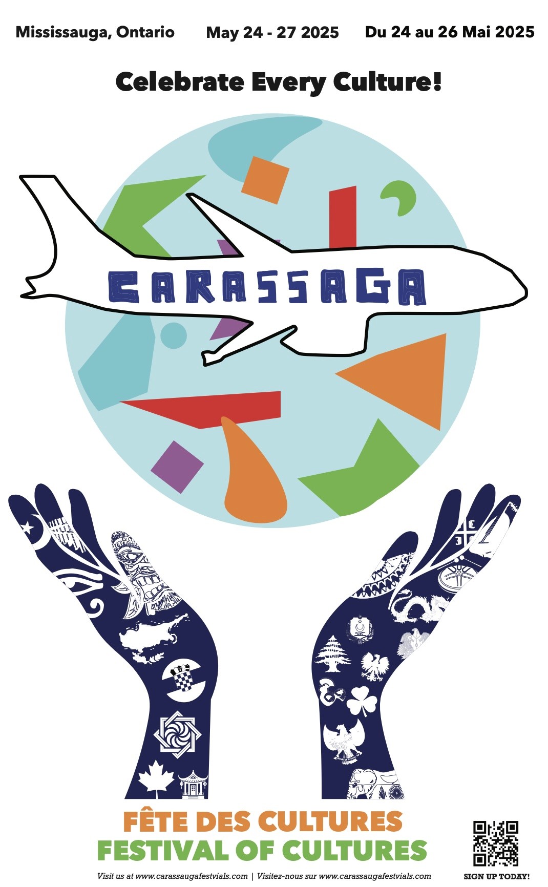
The goal was to design a visual poster system that established a cohesive visual identity for the Carassauga Festival of Cultures. The challenge involved translating the festival’s multicultural spirit into three distinct visual approaches: representational, abstract, and symbolic, while ensuring each design remained legible, inclusive, and adaptable across print and digital platforms. Each poster required original imagery and typography, pushing visual exploration while maintaining a unified brand identity.
Research Direction
Audience/Demographic: Understanding Who the Festival is For
This festival is for everyone who wants to experience cultural diversity and is curious about other cultures. There are no age restrictions, which allows children under the age of 12, families, students, and young adults to participate. Mainly, though, it’s specifically meant for tourists and locals. Therefore, those who attend are often locals in the Toronto area, but some might travel from other cities. They will attend this event, especially if they enjoy exploring other countries’ traditions, food and music. They often know about the theme since most of them are repeat visitors who know what to expect. However, new visitors hear about the theme through social media, promotion or by previous visitors who frequently talk about the event. There is no specific requirement on who they should go with, but visitors usually bring family and friends to share the multicultural experience. Since this festival is always looking for local performers and vendors that represent their country, if interested in participating, visitors need to communicate with their pavilion host directly. Carassuaga Festival of Cultures also values accessibility, which is shown throughout their website, making it suitable for all audiences.
Visual Research
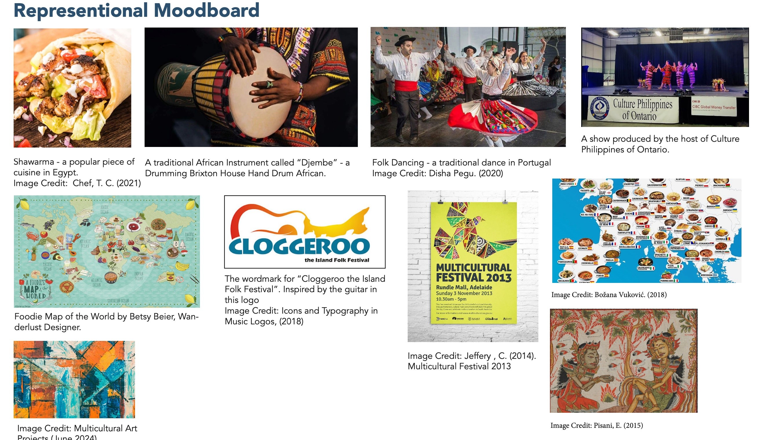
Representational Mood Board
For my representational mood board, I was inspired by the heritage, dance, and international foods from different cultures across the world. I selected images and photographs that showed the aesthetic of this festival through objects that are easily recognizable in multicultural settings. For instance, in Egypt, a popular traditional piece of cuisine is called “Shawarma.” This could be used as some sort of visual identity to attract visitors. Each image selected represents Carassauga’s vibrant energy through food and entertainment.
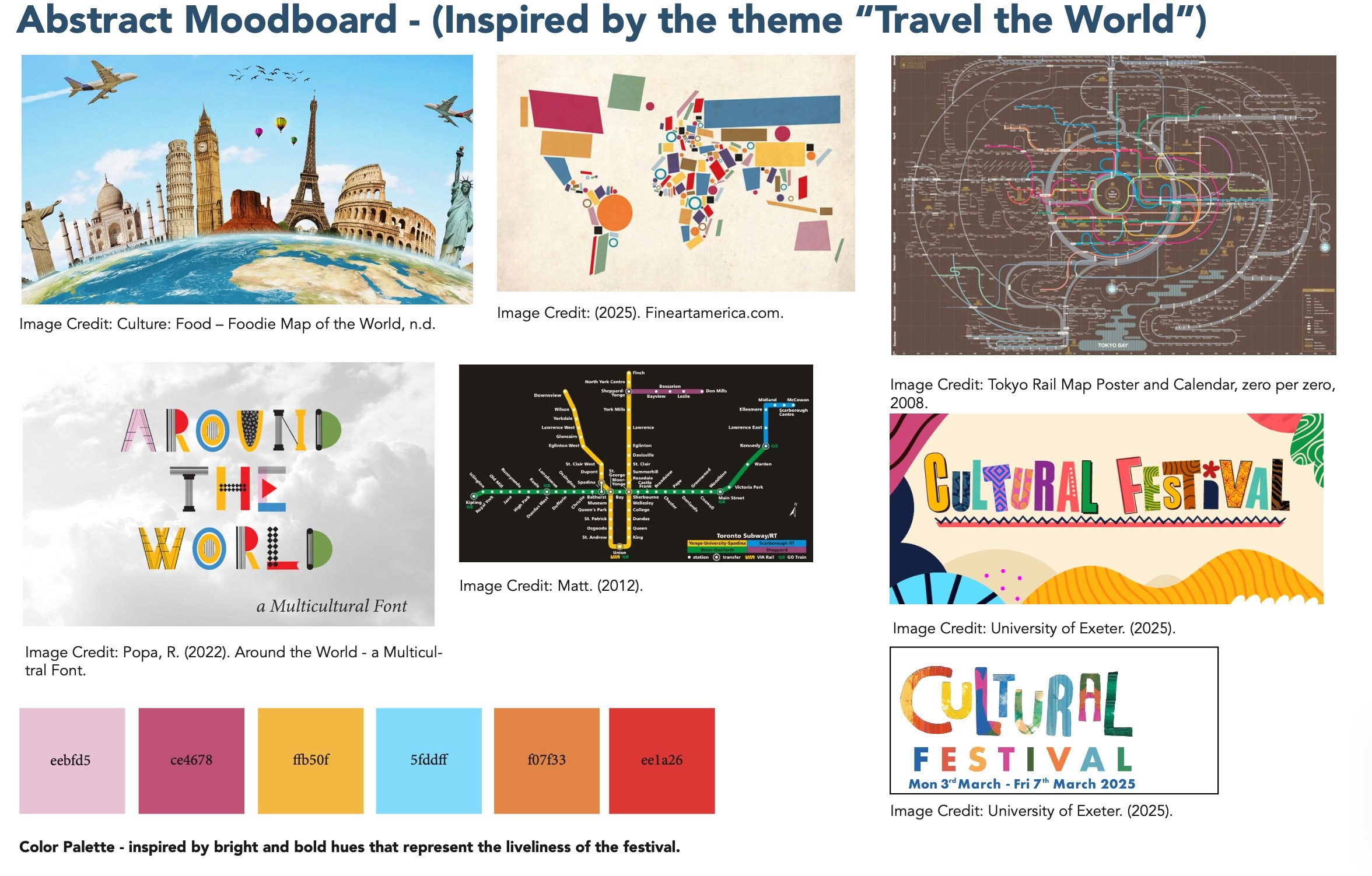
Abstract Mood Board
For my abstract mood board, I was inspired by Carassggua’s theme “travel the city in one day.” With this in mind, I would use organic and geometric shapes to represent the flags of each culture through colour and texture. I would include abstract lines as the main element to indicate motion/movement. Vibrant and bold hues will be used to represent a multicultural festival. I started to take a look at how I might represent the wordmark for this festival. My goal is to use abstract texture and shapes for the letters as a way to represent each culture. Each letter would represent a different pavilion.
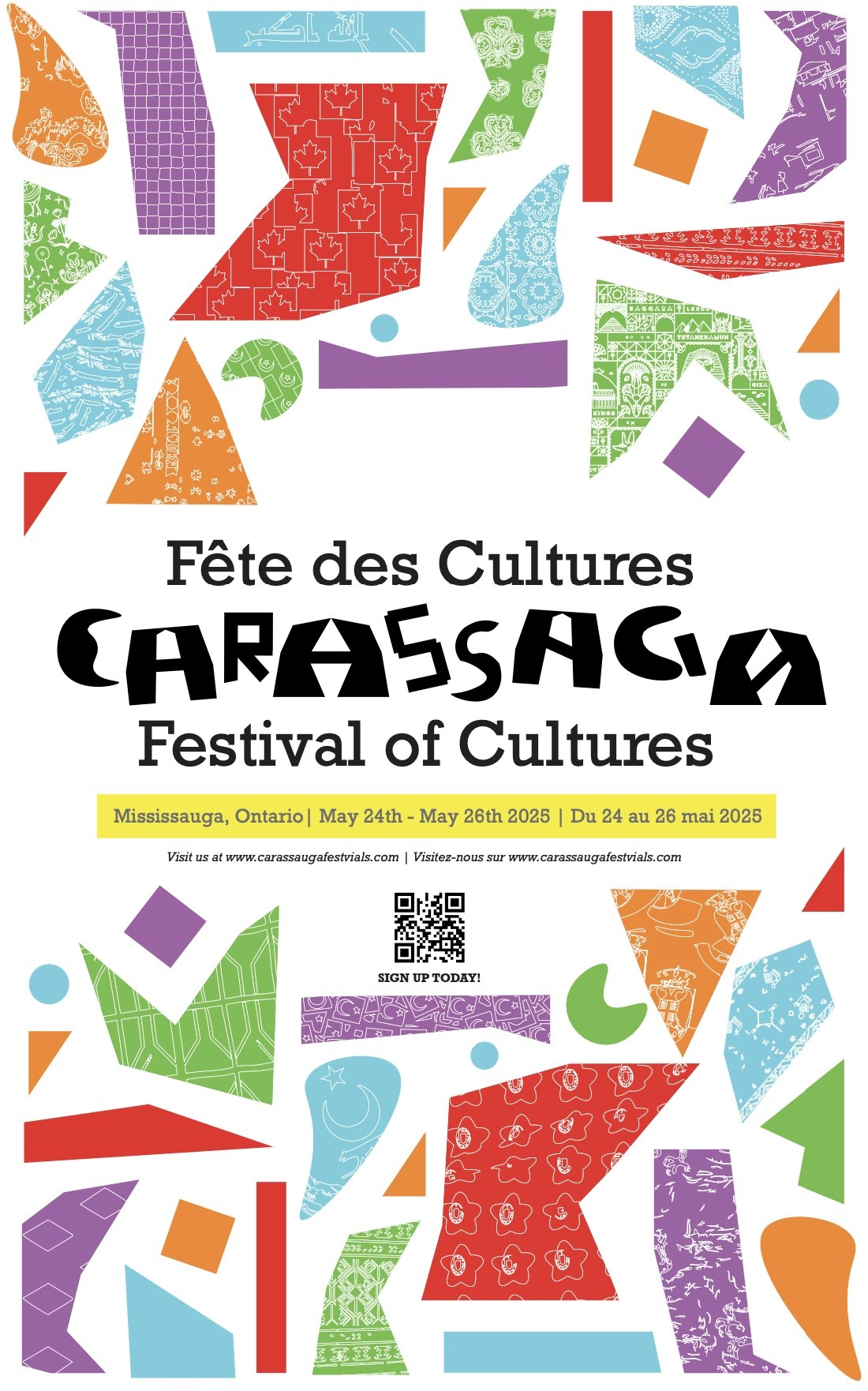
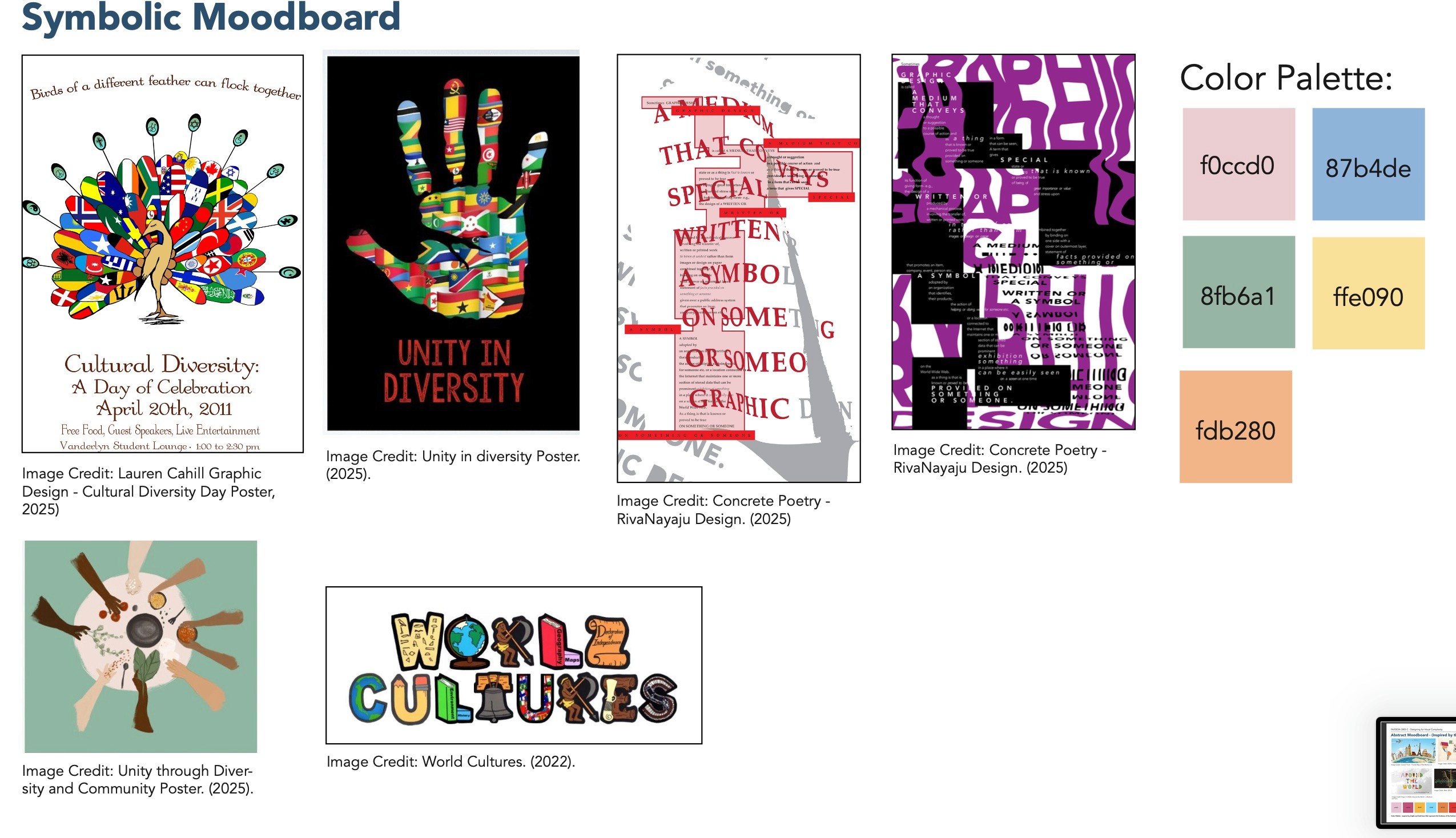
Symbolic Mood Board
For my symbolic mood board, the images selected represent the idea of multiculturalism and cultural diversity, which is Carassuagga’s mission. My idea is to incorporate inclusivity as the main visual language for this poster. This will show newcomers what a multicultural festival should feel like once they step inside.
Defining the Bilingual Languages
Primary Language:
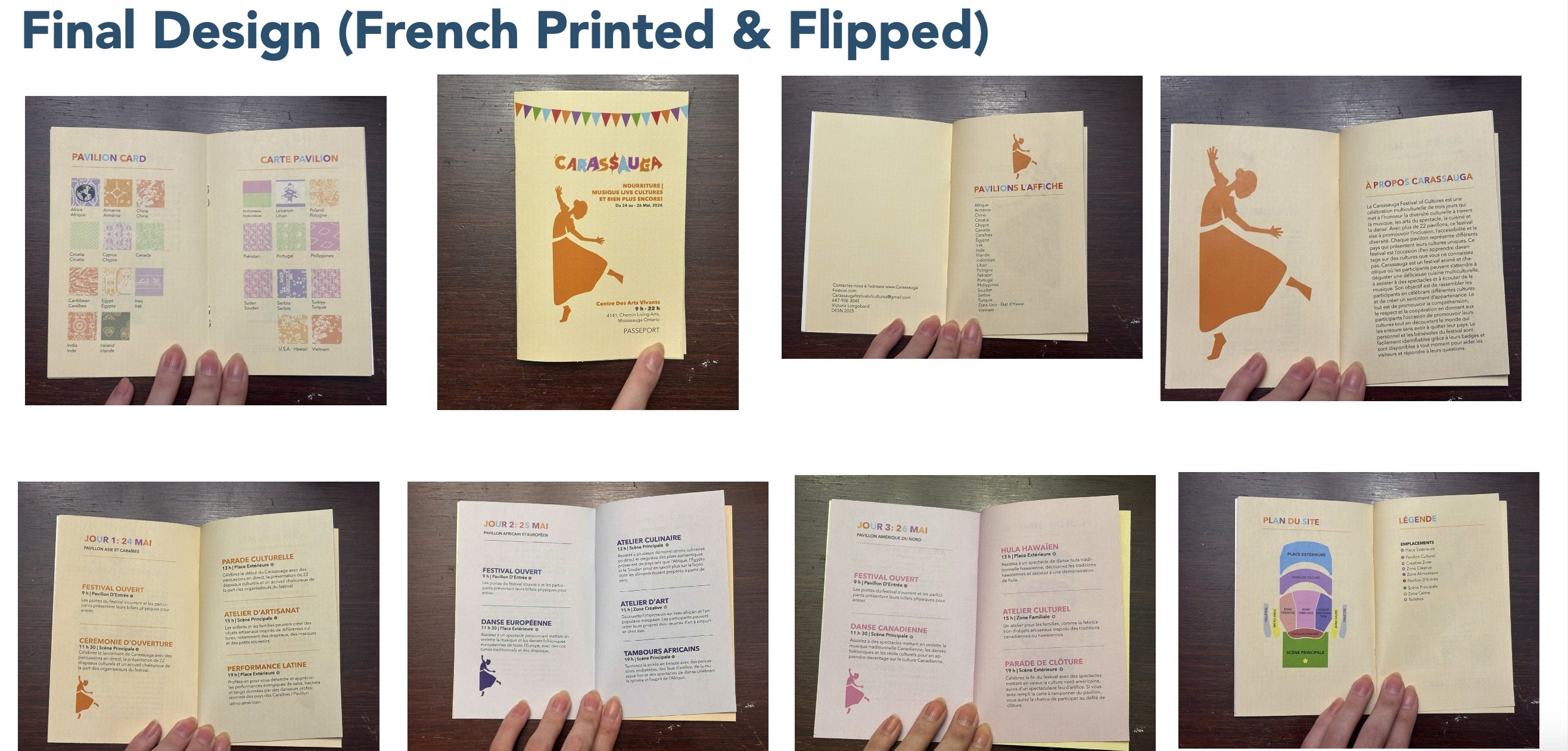
English and French are the primary languages used at the Carassauga Festival of Cultures because English is the main language in Mississauga, which makes it accessible for everyone attending. For bilingual inclusivity, French is used to welcome French-speaking visitors, as it is Canada’s second language.
Secondary Language:
However, each pavilion often uses the native language of the represented country mainly for songs, dances, storytelling, interactive stations, etc. For example, a Portuguese Pavilion might have signage and demonstrations in Portuguese. This is done to help encourage community connection within their heritage, and it establishes authenticity. It also serves an educational purpose for those who are not familiar with a different country’s language.
Phase 2: Festival Brand Applications
Needs Assessment Research (Figma)
My goal is to design branded materials for the Carassauga Festival of Cultures, a multicultural festival that features 22 pavilions from around the world. I am designing for organizers, staff & volunteers, and new/recruiting attendees.
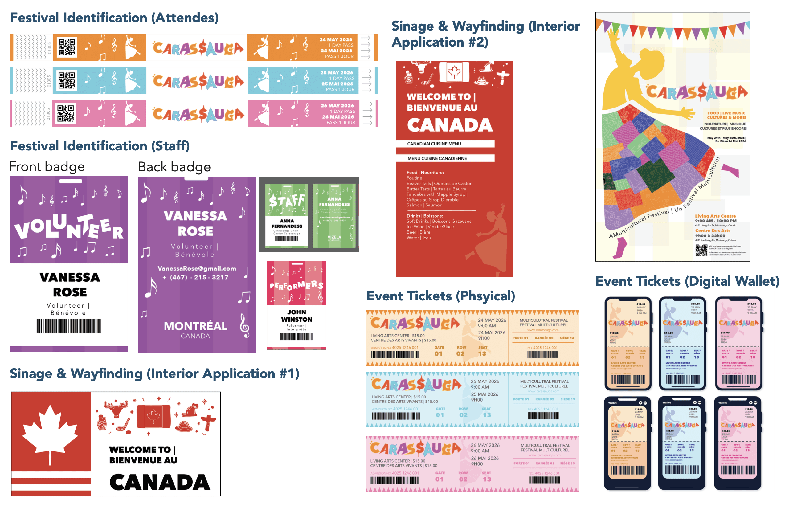
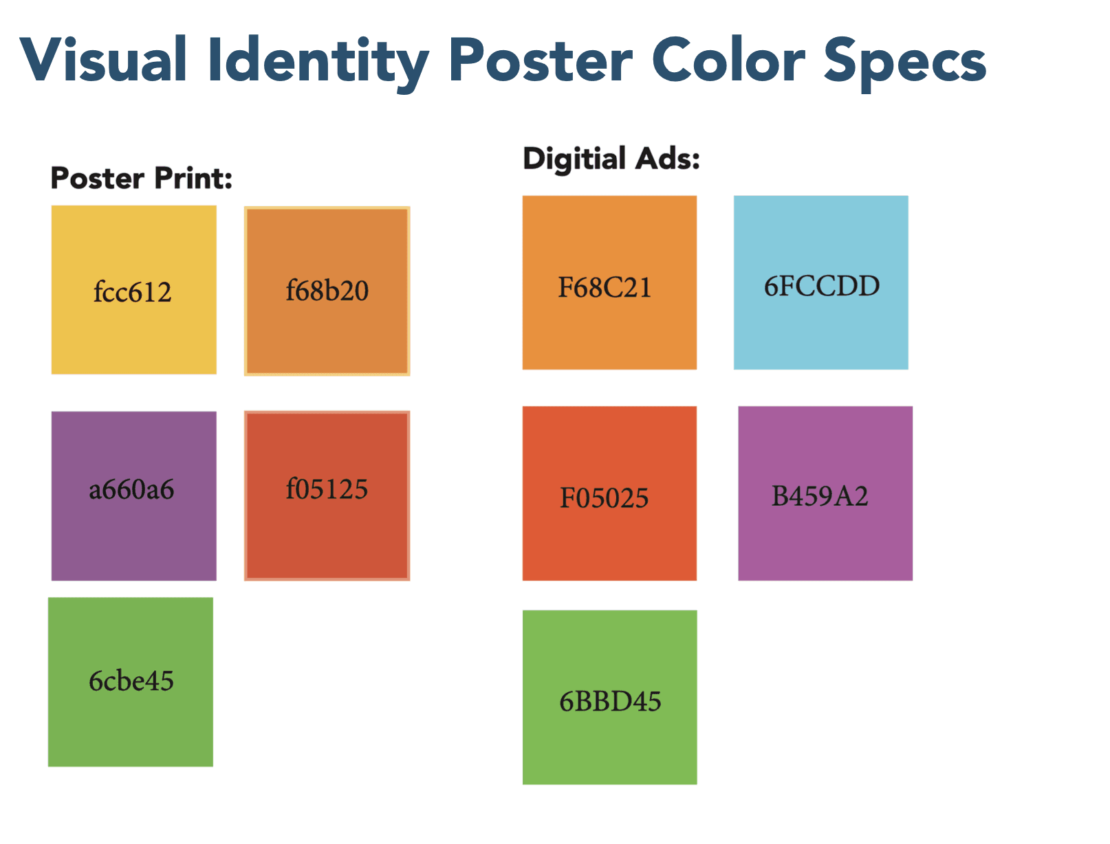
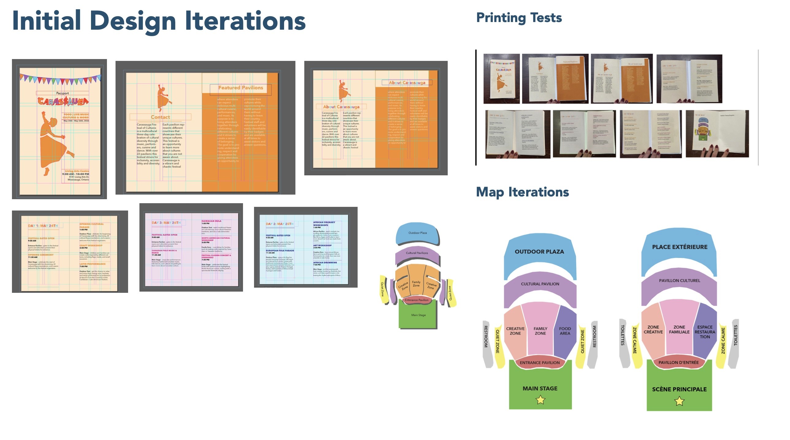
Overall, my designs will feature bright & bold hues that capture the essence of Carassauga. The tickets will be designed based on the 3-day festival duration (each ticket will be a different colour which helps to improve the organization for the festival organizers & staff). Staff & volunteers will be identified by passes, while attendees will wear wristbands. For bilingual audiences, there will be translators & volunteers who speak different languages to help them find their way around the festival. A map will also be provided on a festival passport (program).
Final Desgins
Design Rationales
Tickets
The colour of the tickets came from the colours used in the wordmark in project 1 to keep a consistent visual identity.
Badges
Staff will wear orange colour badges for the first day of the festival. Based on what station they are in, staff will either have a music badge related to entertainment or a food badge. This will help the attendees identify the staff and which station they are a part of when they need to locate something or ask questions.
Staff will wear blue-coloured badges for day 2 of the festival. Staff will wear pink colour badges for day 3 of the festival. Volunteers will all be given purple badges to ensure that they are easily identified from the staff.
Pavilion Sign Example for Canada (Rationale)
When the attendees enter the festival, they will be greeted with directional signs that tell them which way to go. As for the location of each pavilion, this will be shown in a passport program. When the attendees find the right location for the pavilion, they wish
to go to, they will be greeted with multiple signs/banners for each country that say “welcome to ____.” These banners/signs will be directly above the pavilion stand. Along with a banner/sign that will hang above the pavilion stand, there will also be a large banner displayed. This will include information like the location and featured cuisines.
Tote Bag Merch
At the end of the festival, each participant will be given a tote bag as a way to remember the festival. If an attendee completes their pavilion stamp card (which will be at the end of the passport festival package), they will also get an extra t-shirt with it. The first 100 people who finish their full cards will be able to participate in the closing parade.
Phase 3: Festival Program
Approach - Physical Printed Passport
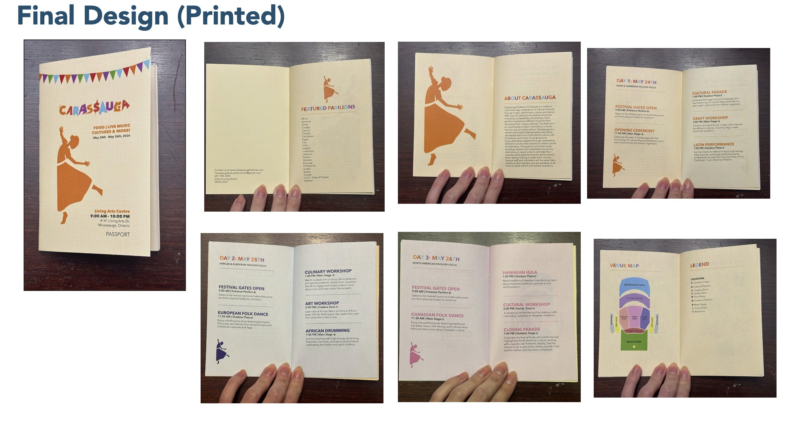
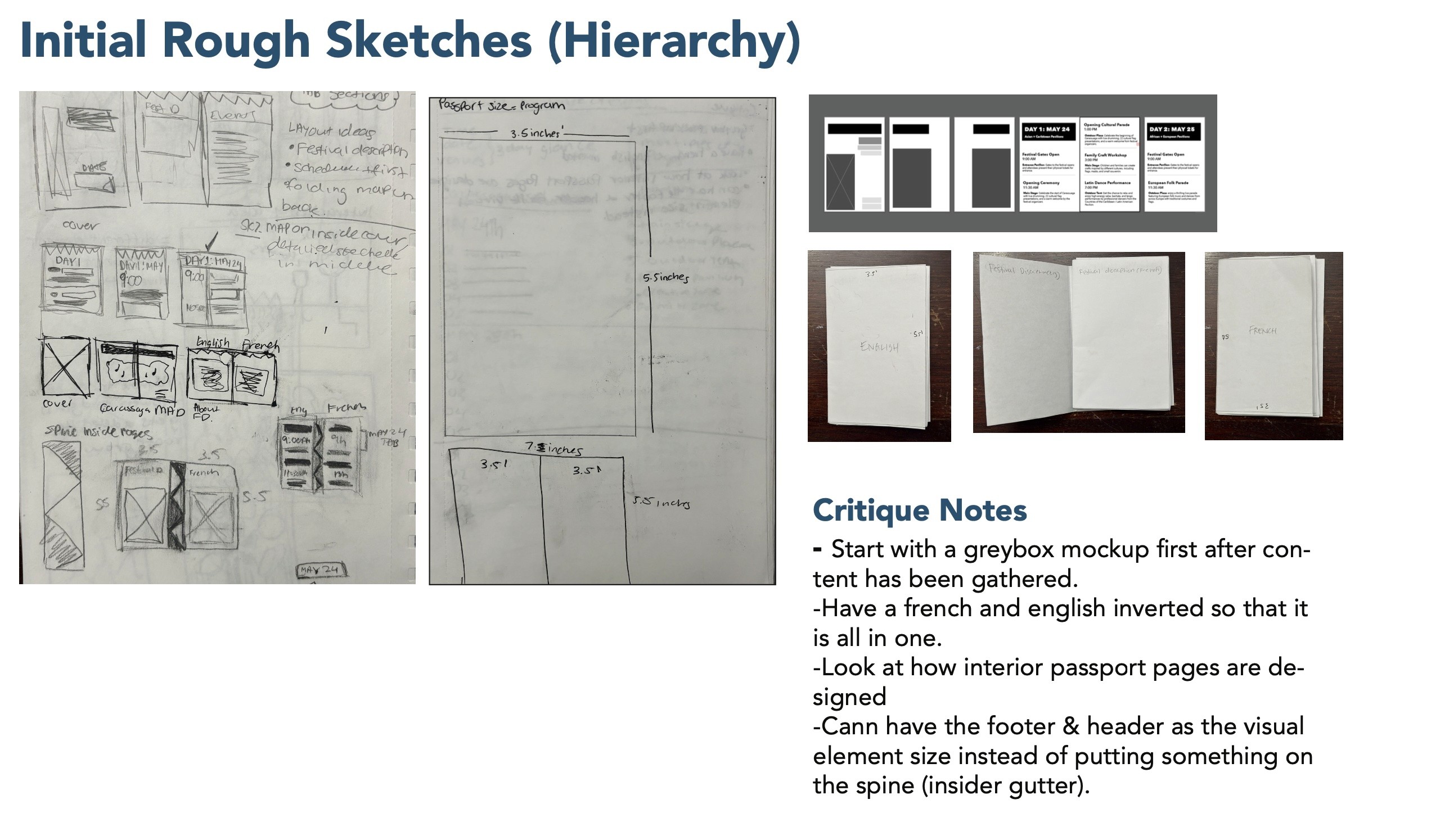
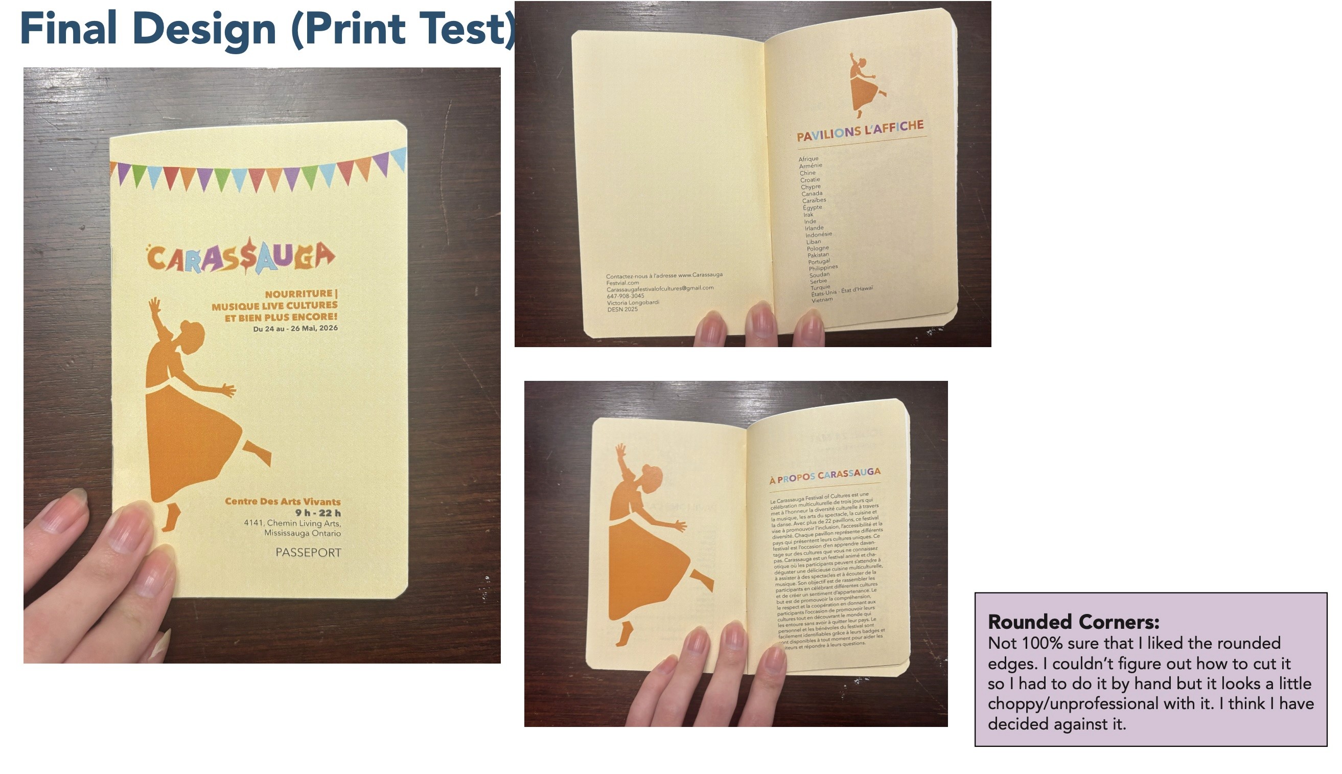
I chose to design a physical festival program rather than a digital version to prioritize accessibility and ease of use. Many attendees are already familiar with printed programs, and a pocket-sized format ensures it’s convenient to carry throughout the busy festival. Considering the festival’s chaotic environment, requiring attendees to access digital devices could be troublesome, especially for elderly participants who might need assistance. A physical program ensures inclusivity and seamless navigation for everyone.
Program Delivery Method
The program is a compact, pocket-sized booklet designed to resemble a passport, reinforcing the festival’s theme of “travelling the world in one weekend.”
Final Passport Designs